Possibly my favourite model that I have done, the DB5.

To improve this model, I would first redo the front headlights. They just look too cloudy and should have a chrome trim. I could also use a target spotlight to produce actual light from them. I think the material used on the windows is too reflective, so I would make them more translucent by decreasing the reflection level.
Model 2 - Character
This model was used for Bond, then copied and adjusted for Goldfinger.

As for improvements, first off would be the body detailing. I don't like the shape of the jacket around the neck. Also, by modelling the character with baggy clothes, the biped didn't work fantastically. When the arms dropped to the side to walk they would intersect the body noticeably. To fix this, the character would be modelled 'naked' and clothes would be added later.
Model 3 - Gun
Another of my favourite models, just unfortunate that it can't be seen properly in the 2010 version of Max.

To improve on this model I would fix the handle. The darker grips are too flat with corners on the back. On a real gun, the grip is a more rounded shape to fit the palm. There are also a few minor smoothing errors. These would be fixed by just spending more time using smoothing groups.
Model 4 - Laser
The laser is animated in the first scene of my animation similar to the film.

As I was trying to stay faithful to the film, the red laser should be visible down the length of the machine. This would be fixed by making the cylinder inside the blue rings glow red like the laser beam. A simple fix, but I forgot to change it and it doesn't look bad as it is. I would also change the material of the wood on the table as it doesn't look as nice as it could. This would just be a case of redoing the material with better colours and tiling.
Model 5 - Laser Room
I did my best to replicate this scene from the film. In the end it turned out quite well and I am pleased with it.

To improve on this I would add more things to the room. Some more objects could be made and put on desks, but I would mainly like to fill the floor space a bit better. Also, the chairs look terrible. They were built in about 2 minutes. This could easily be improved with more effort, but as they are just background objects, I felt no need to spend time on them for the purposes of this short animation.
Model 6 - Glass Shatter
This particular model / animation took a lot of time and independent learning, but in the end had a good effect. The glass material and daylighting system combined make it look even better.
To improve this I would have cut the glass into many more segments and in a more radial pattern to simulate a bullet smashing through better. As this was my first attempt at glass breaking, the limited amount of segments was enough. More segments would also vastly increase render times.
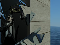
Model 7 - Ocean and Mountains
I can't take too much credit for these two. Although I did build and adjust them to my needs, they were a product of two great online tutorials. The links have been mentioned before in the blog, but here they are again.


Ocean:
http://www.3dtotal.com/team/Tutorials_3/3dsmax_water_surface/water_surface_01.php
[Internet] [Accessed 06/04/2011]
Mountains:
http://www.3dtotal.com/team/Tutorials_2/terrain/terrain_01.php
[Internet] [Accessed 06/04/2011]
As for the ocean, I would have perhaps liked the waves to have been a bit rougher. To improve this, I think there is an option in the parameters to define the wave height and speed.
The mountains look great, but perhaps the fog could be improved. I would have liked it to be an area of fog rather than just in the background. I think this is fixed by using 'volume fog' instead of 'fog'. I stuck with normal fog as the rendering time would have been increased a lot and I couldn't quite get it to look right.
No comments:
Post a Comment